Design Work
*
Design Work *
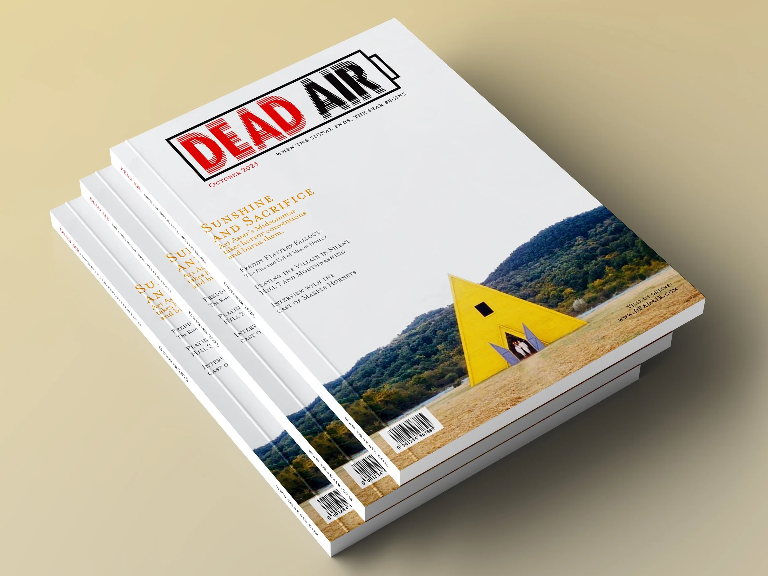
DEAD AIR Magazine
DEAD AIR Magazine is a monthly analog horror magazine created in an editorial design class. The magazine includes front-of-book articles, games, and four features about different aspects of the analog horror genre. The identity of the magazine is themed after camcorders and static screens.
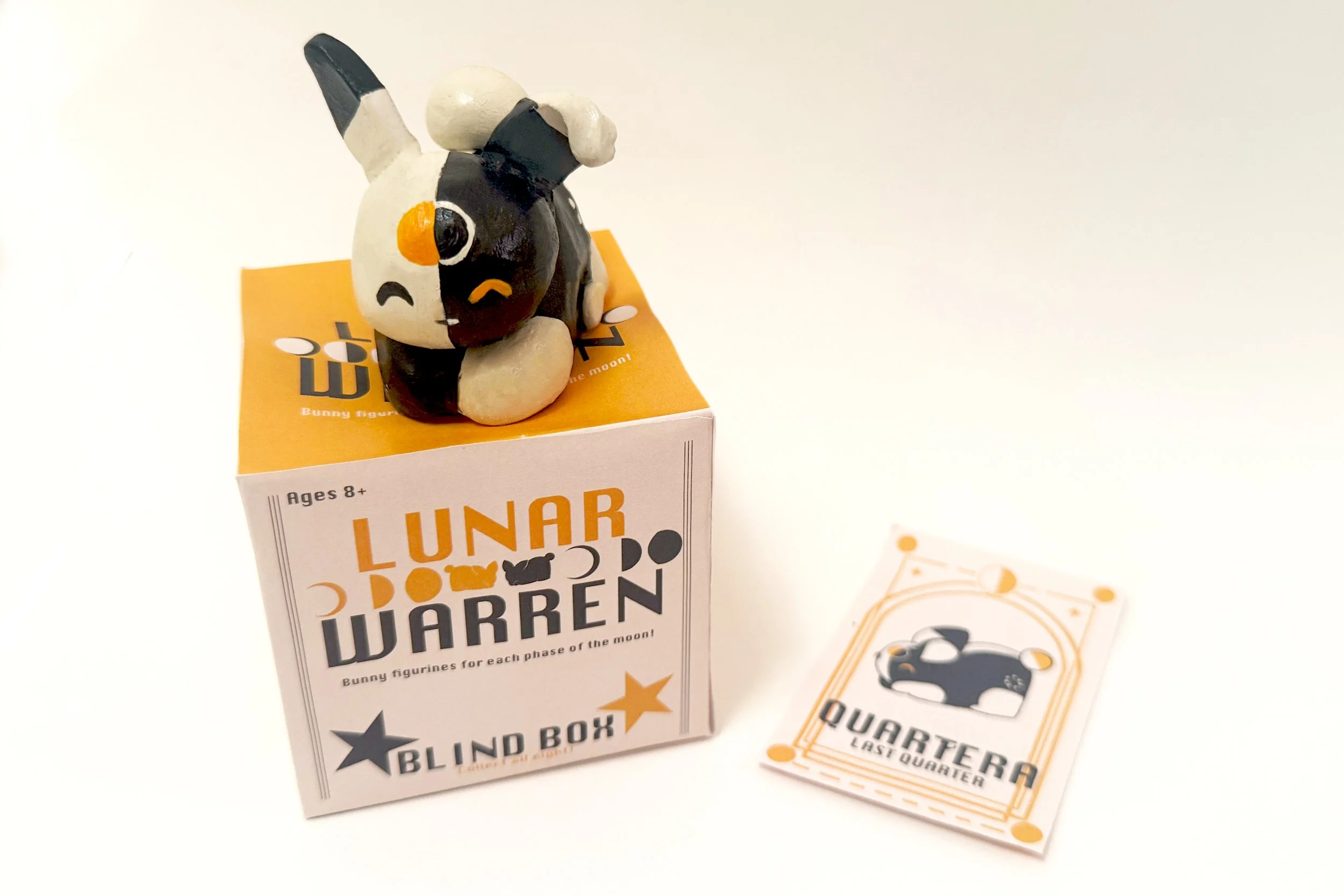
Lunar Warren
Collectible Toys
Lunar Warren is a collectible toy series based on the phases of the moon. There are eight bunny figurines to collect, and they each come with a trading card that dives into that respective bunny's personality and phase of the moon. Within each box is the character and their card.
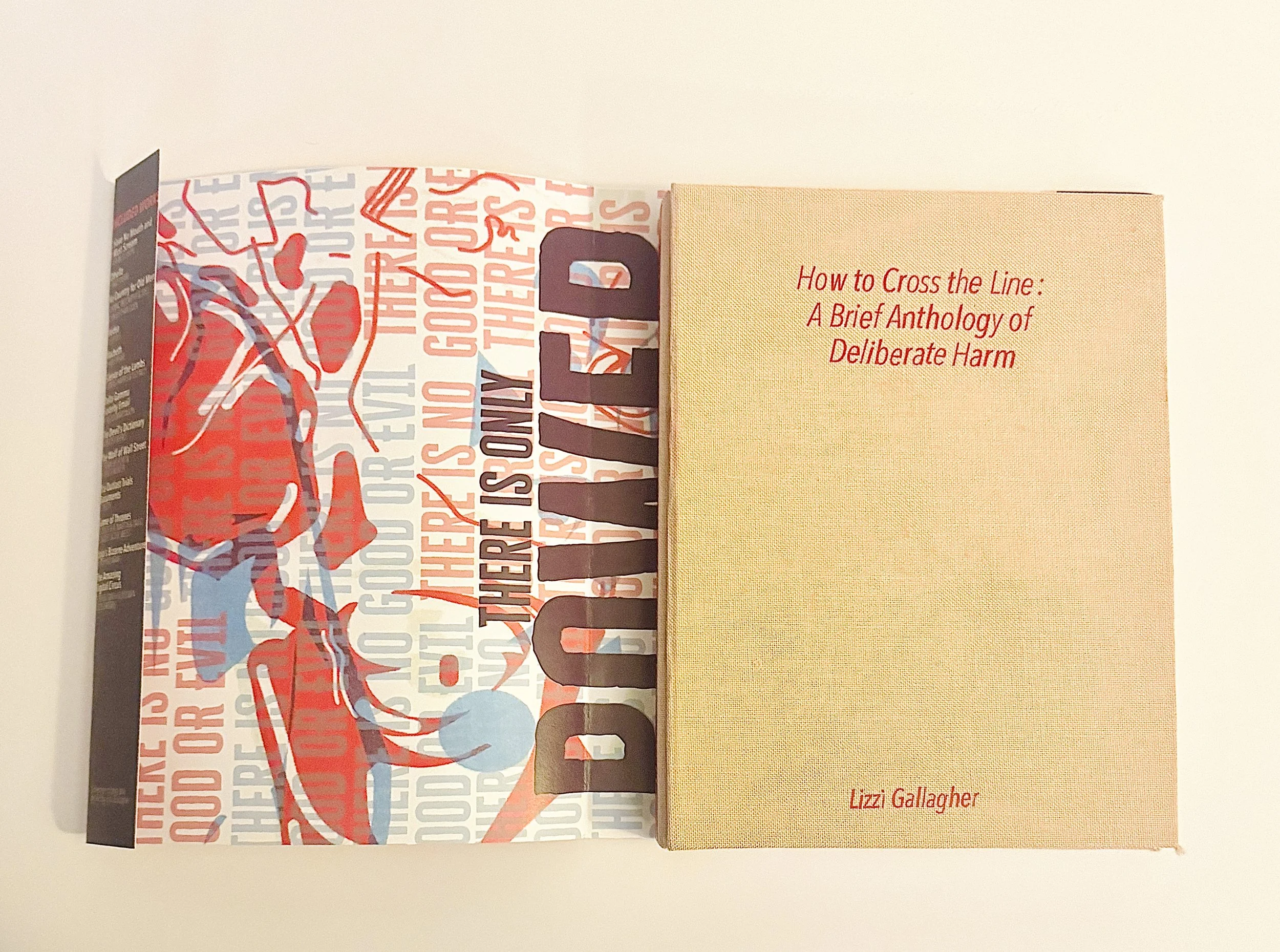
How to Cross the Line
How to Cross the Line: A Brief History of Deliberate Harm is an anthology of media (TV shows, movies, plays, books, etc.) examining bad morality. It explores what it means to be a bad person, treating the texts as a guide for the reader to follow, serving as an opposite to self-help books.
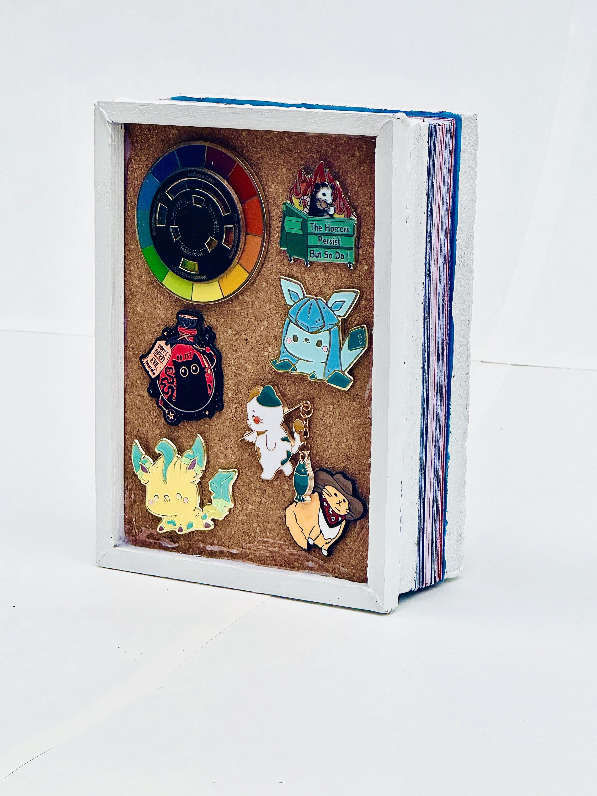
Lapel Pin Research Book
This archive and research book focuses on the history and usage of lapel pins. After being instructed to create a book about an object that resonates with me, I chose lapel pins, as I have collected a large amount and have them adorning the majority of my possessions.
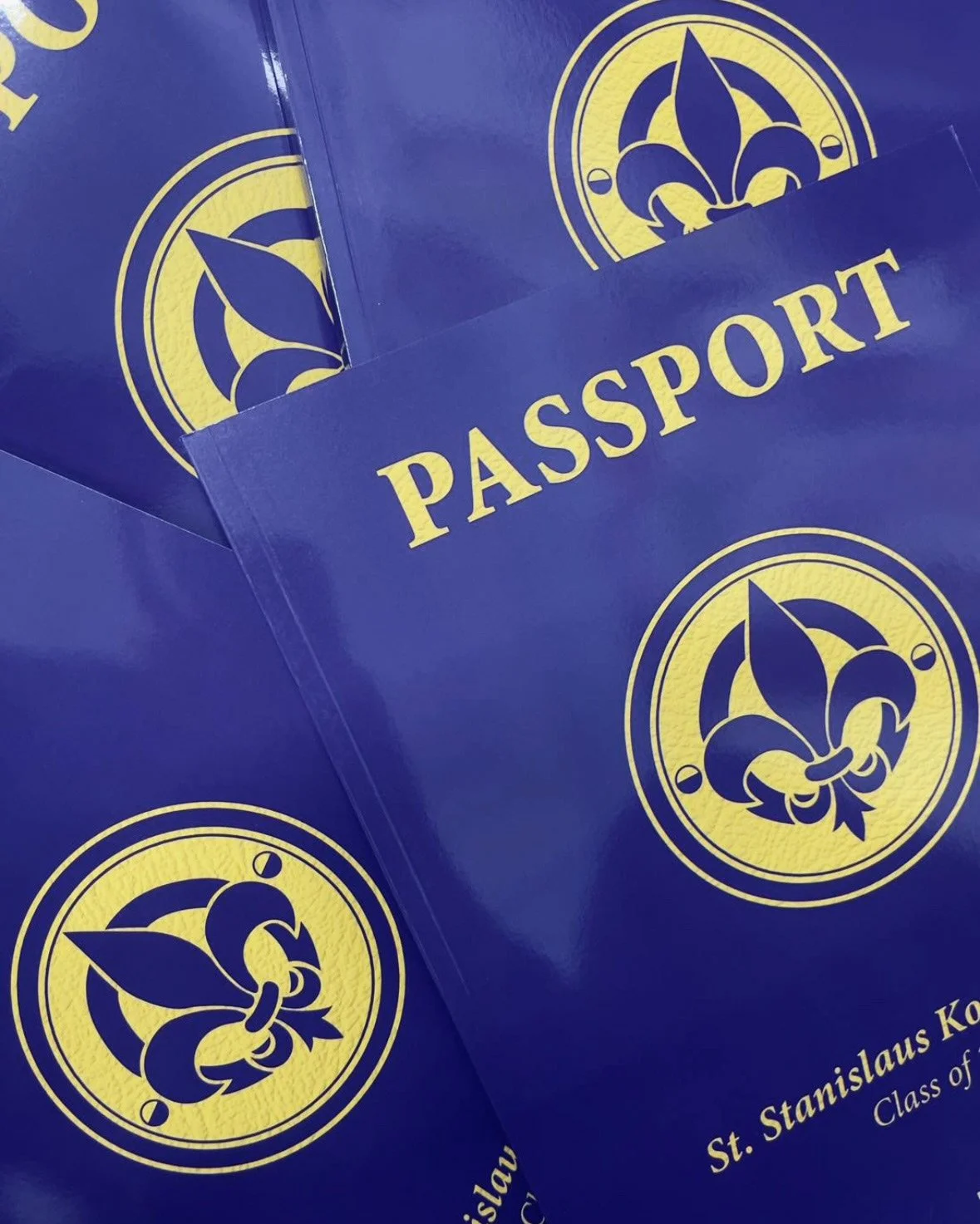
St. Stanislaus Kostka CAQN Yearbook Covers
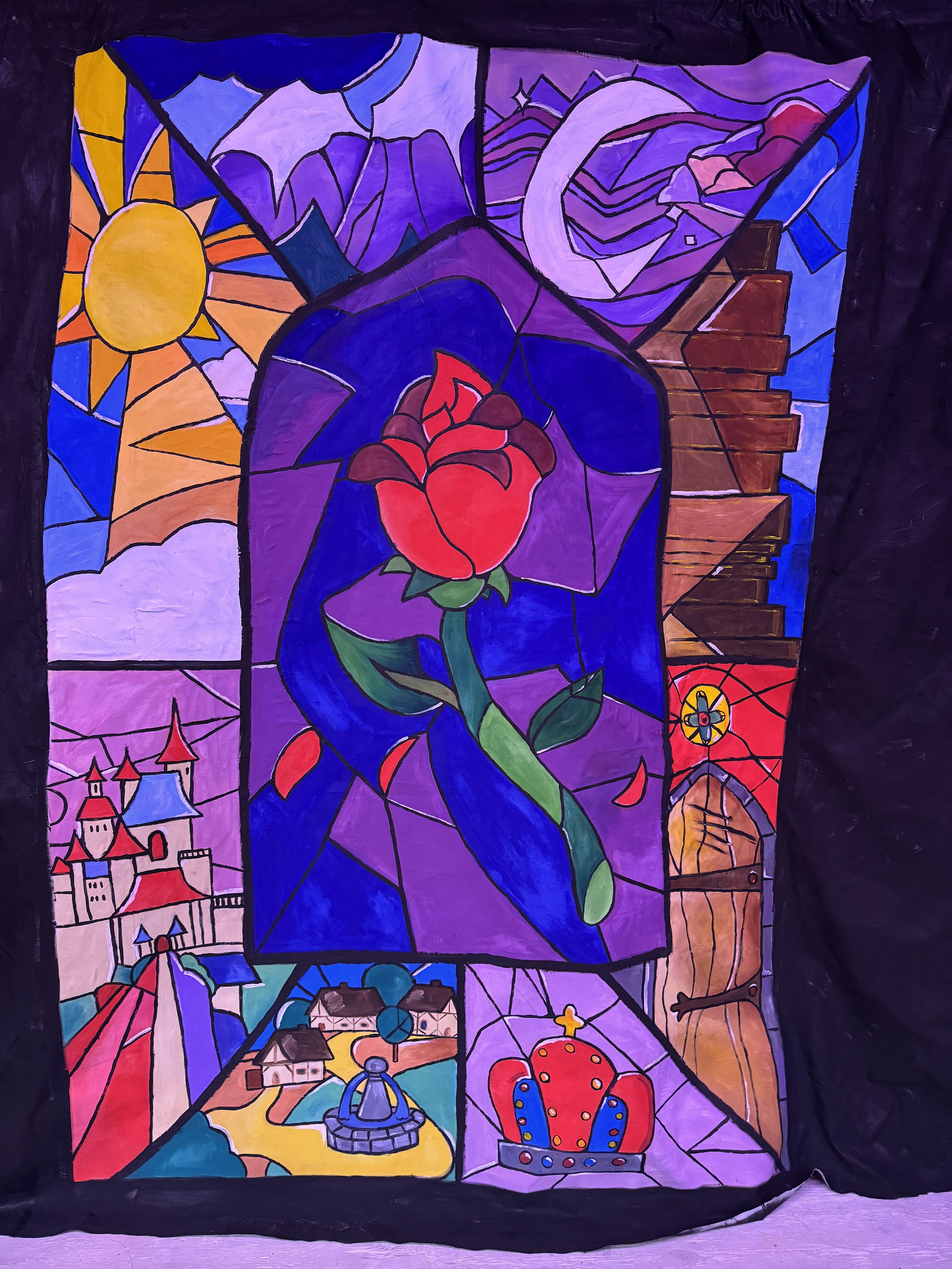
Beauty and the
Beast Set Design
I designed the cover of the St. Stanislaus Kostka CAQN 2024 and 2025 yearbooks. The theme for 2024 was music and had a Spotify-inspired look. The theme for 2025 was travel, and so the cover reflects a passport complete with baggage tag stickers on the back.
From December 2024 to March 2025, I worked as a set designer for my middle school's production of Beauty and the Beast. Here I designed the set and painted each part of it. This includes (in order) a painted stained glass window, a bookcase, a medieval-inspired town, and castle walls. Each panel was completed with acrylic paint and a sheet.
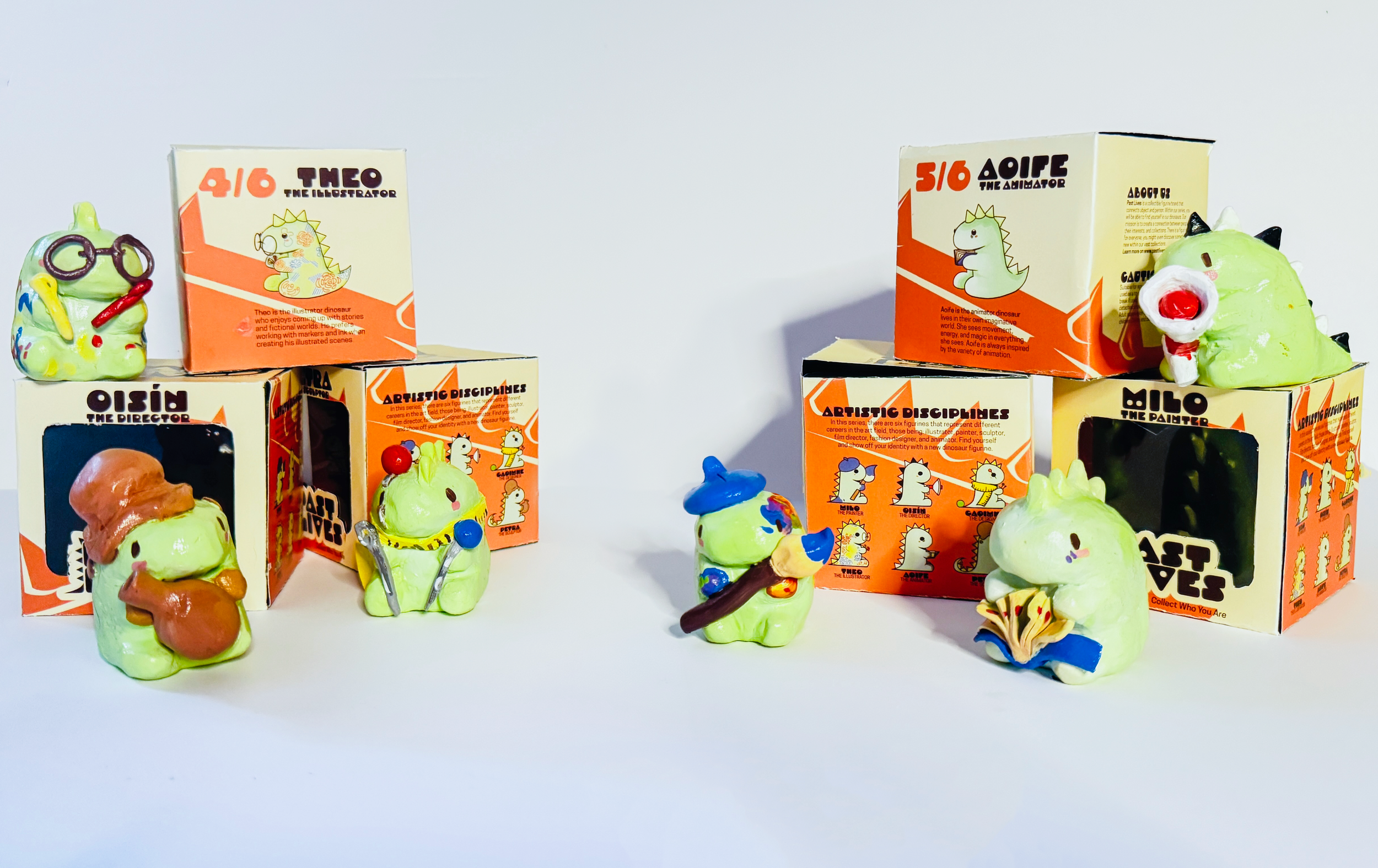
Past Lives Collectibles
Past Lives Collectibles takes careers and interests and personifies them into small and cute collectible dinosaurs. Collection 13 is Artistic Disciplines, where all dinosaurs have a career in the art field. There is a fashion designer, painter, illustrator, animator, film director, and sculptor.
Risograph Illustrations
Risograph illustrations made into zines. The zines feature illustrations about Jojo’s Bizarre Adventure, The Outlast Trials, and flowers with crosshairs.
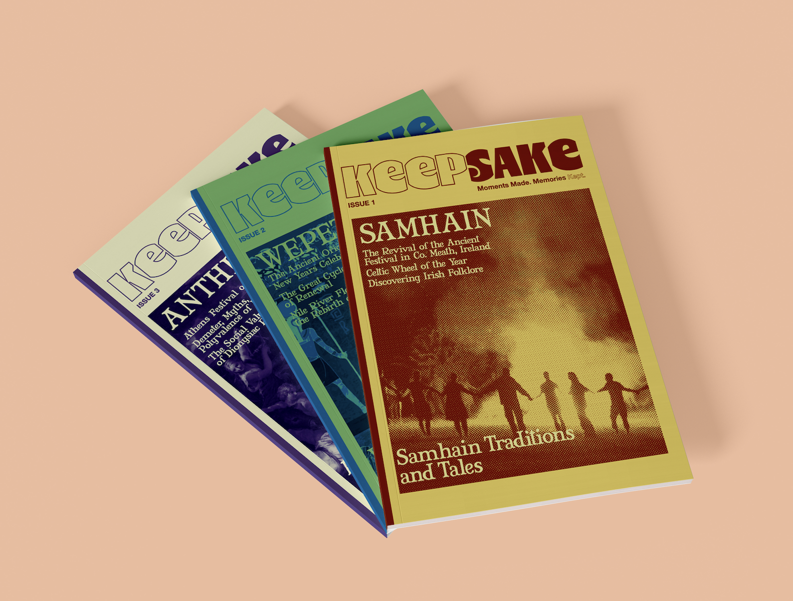
Keepsake Magazine
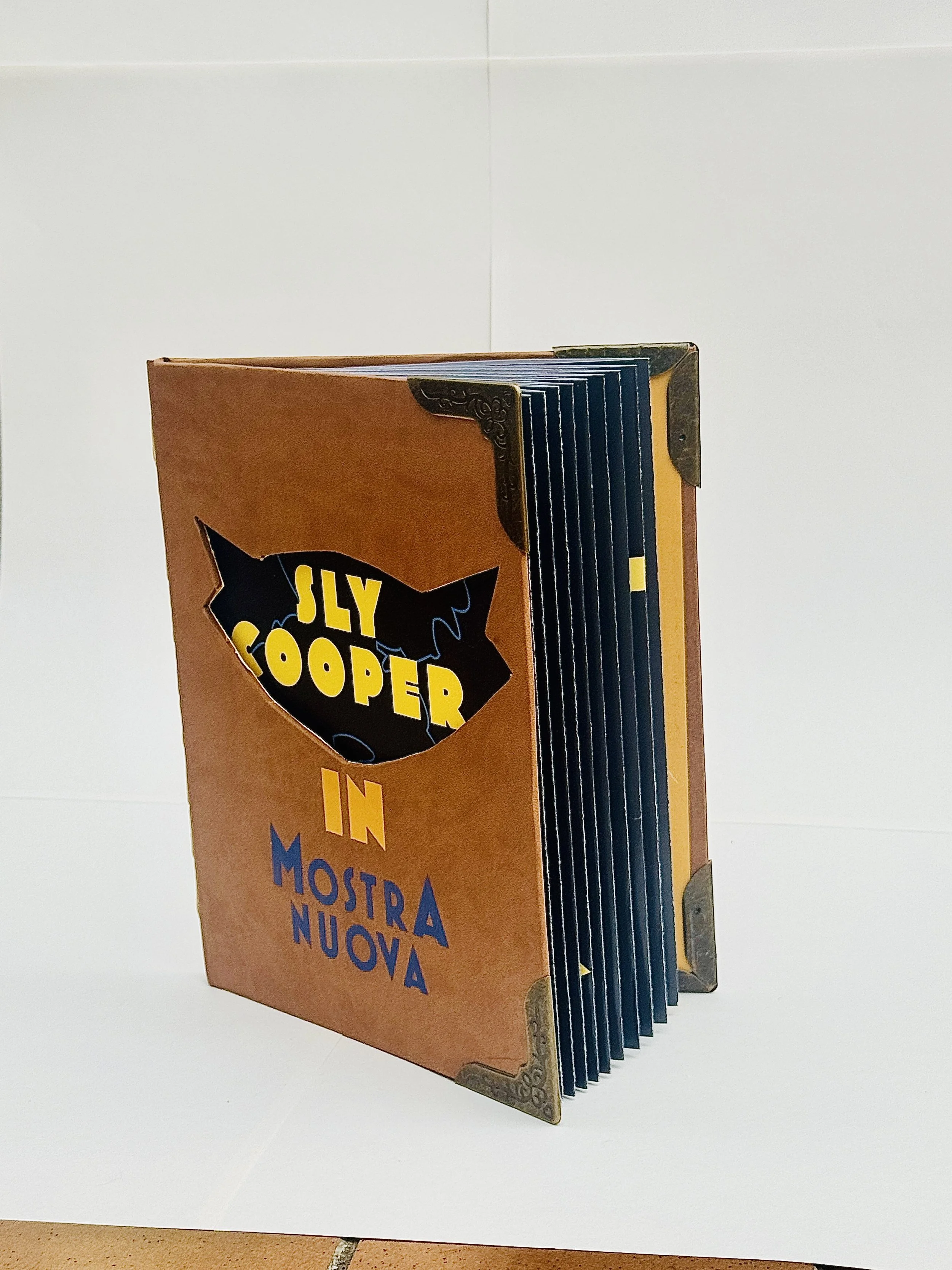
Sly Cooper
Type Personification
Drawing from themes of memory and community, KEEPSAKE magazine visits countries around the world to learn and educate its readers on ancient but revived festivals. The first issue examines Samhain, an ancient Celtic festival that evolved into modern-day Halloween. Each issue utilizes halftones and a three-color palette.
This book takes the typeface, Mostra Nuova, and translates it to the Sony video game character, Sly Cooper. The Sly Cooper series are my favorite video games and I wanted to show my love and appreciation for them by illustrating the mechanics of the game through Mostra Nuova.

SOLUS: A Solo
European Travel App
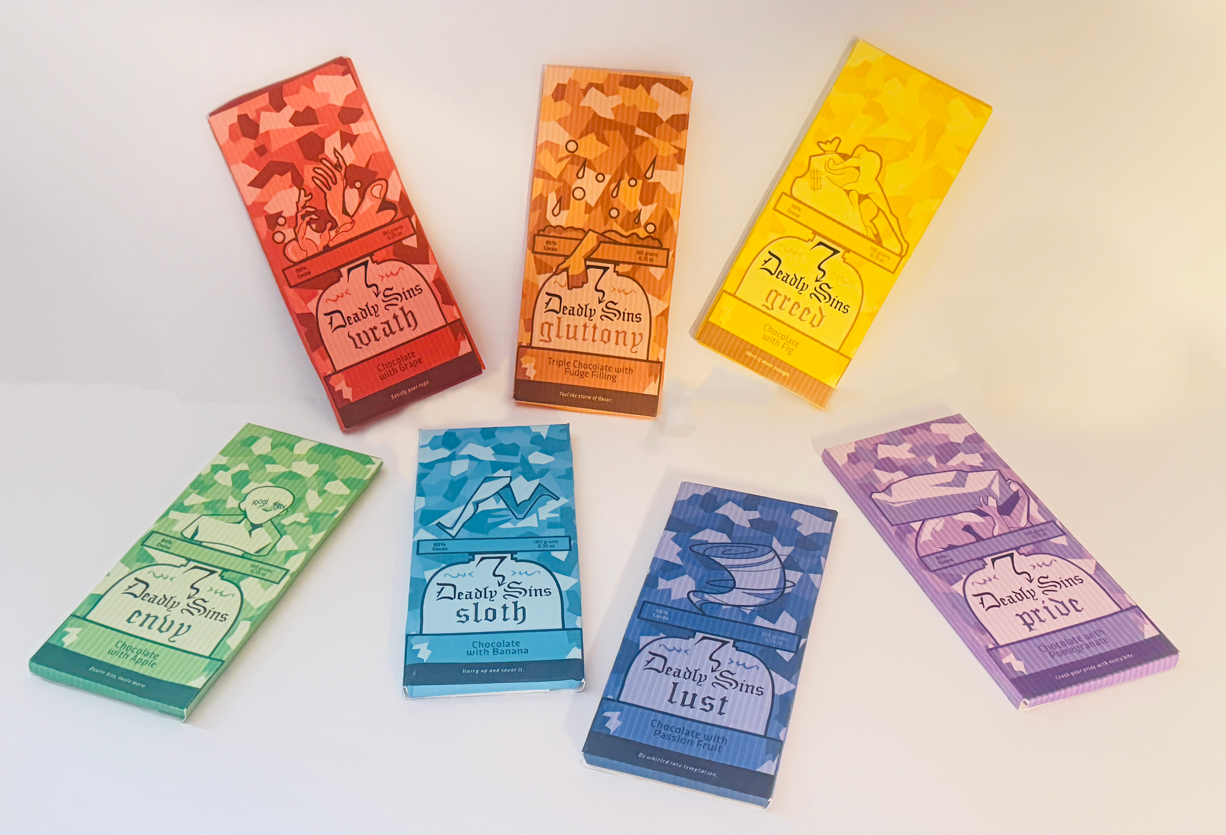
Seven Deadly Sins Chocolate Bars
SOLUS is a solo European travel app designed to help people travel to Europe on their own. It provides activities that can be done without a group ranging from main tourist locations to smaller local events. Users can book events through the app and be safe exploring Europe.
This seven-bar chocolate set embodies the Seven Deadly Sins, blending stained glass aesthetics with Dante’s Divine Comedy. Each bar features a symbolic fruit—except Gluttony, which boasts extra chocolate—and depicts the sin’s punishment from Dante’s Hell and Purgatory, offering a rich, artful indulgence.
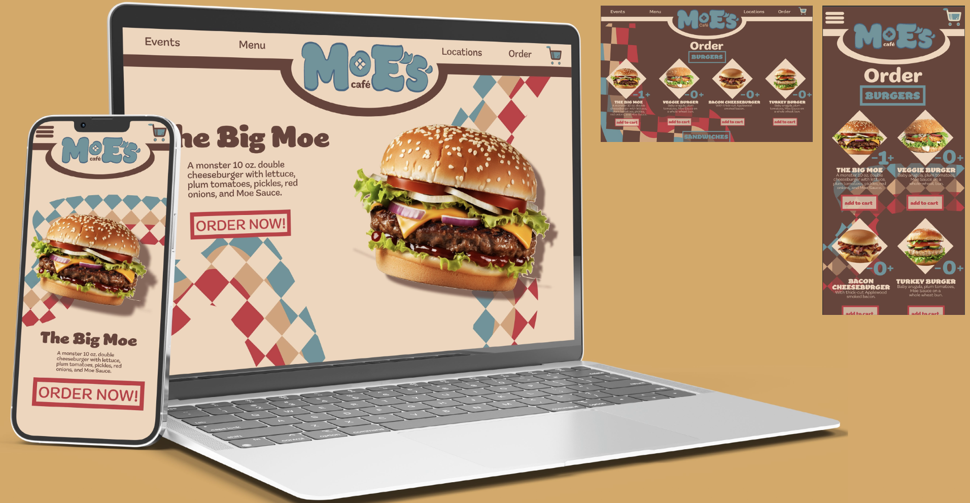
Moe’s Cafe Rebrand
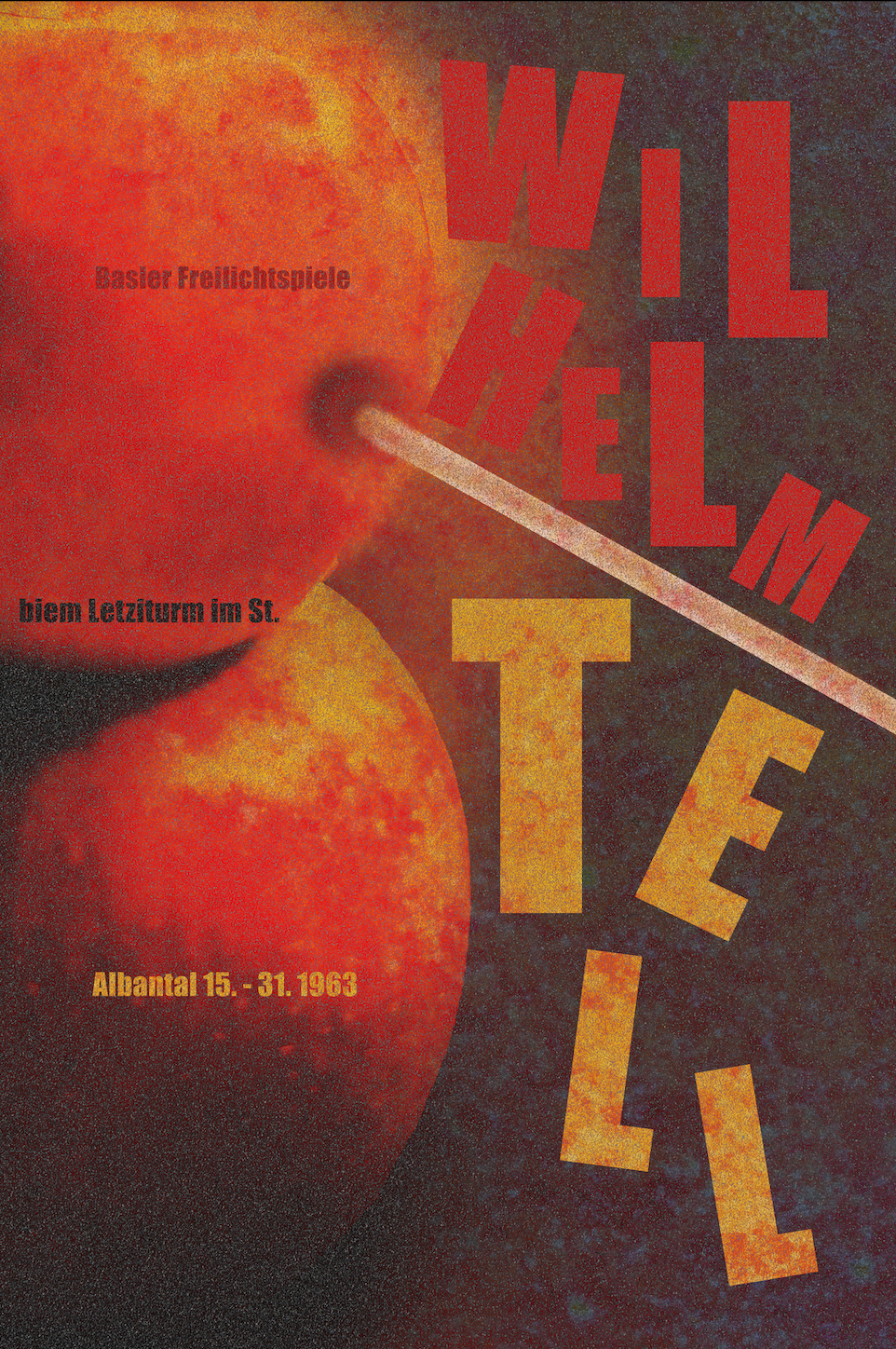
Wilhelm Tell Posters
For Moe’s Café, located in the School of Visual Arts East and West buildings, I developed a rebrand inspired by 70s retro diners. Using vibrant colors and nostalgic design elements, the goal was to create an inviting, inspiring space with a familiar, welcoming atmosphere for students and visitors alike.
These six posters are to advertise a performance of the opera, Wilhelm Tell. Three are black and white and the other three utilize color. All six posters are meant to display interesting typography inspired by Armin Hofmann and have abstract photography of an apple.